


Narrow Intersection

 Text: Caroline Clements Images: Tobias Titz & Madeline Kidd
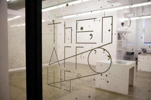
The Narrows straddle the enviable aesthetic territories of art and design. The result is gallery admired by fellow curators and a back catalogue of exhibition flyers that are eminently collectable. Caroline Clements talks to Warren Taylor at The Narrows gallery about wall flowers, intelligent insects and how this gallery in Melbourne is walking the line where art meets design.
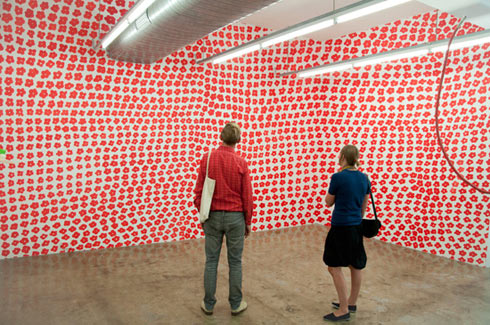
When I get to The Narrows gallery on the second floor of the old city building, I am greeted by wall flowers. To my left Melbourne artist Renee Cosgrave has hand painted hundreds of little red flowers in a wall-distorting pattern over the left side of the gallery space. “It took about four days”, gallery director Warren Taylor recalls. “She worked from a projector and painted over the projection on to the wall. There is a pattern, but it sort of distorts the wall, particularly in the corners.”
After recently moving from 2D canvases to larger scale, installation type pieces, Cosgrave was interested in putting a non-geometric piece in the slick space of the white gallery walls. With The Narrows more often home to clean, sharp design posters or paintings derived from angular shapes with fluid design aesthetic, Taylor was enticed by the idea of something less design-centric. “She (Cosgrave) has an agenda with site specific work changing the architecture of the space it is in,” He says of his former student, already at the forefront of Melbourne’s emerging artists.
On the facing wall and hanging from the ceiling are several smaller pieces by Merryn Lloyd. A fellow student and collaborator during art school, Lloyd has exhibited with Cosgrave before. Concsious of Cosgrave’s dominant wall of red flowers, Lloyd has opted for a non-traditional medium, dripping coloured wax onto cut-up artist invitations. “I often feel confused by Merryn’s work but this confusion leads to my curiosity,” says Cosgrave of Lloyd’s art on their own exhibition invitation.
This collaboration is perhaps an exploration of the territory where design and art meet. “The gallery is seen to focus on art and design” Taylor states, drawing attention to things such a international design journals, wall posters, record covers, and typography. It is also interested in comparing the movement of design over time, what that says about designers, and its cross over into the art world. After teaching at Monash for 12 years, Taylor feels it is an interesting climate for design, “people are becoming much more specialised and not multi-tasking as much.”
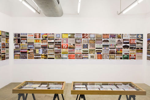
He references type designer Tobius Frere-Jones who made it big when he designed the font Gotham, which was used throughout the Obama election campaign and also on the September 11 monument at the World Trade Centre site in New York. Frere-Jones came to Melbourne last year for the Australian Graphic Ideas Conference and brought with him some of the 3000 photos he had taken as research of guilded signage in Manhattan. He showed a series of these photos in the gallery as a way of displaying the process of type design. “We are trying to curate shows on design that sit outside commercial design practice. We could have showed a series of his type design, but everyone has seen that now anyway. The interesting part is in the process,” Taylor explains.
With type in mind, The Narrows has also recently held a screening of cult classic Phase IV (1973). Screened at the Rooftop Cinema on an artist appreciation night it is an 86-minute long sci-fi feature directed by the man made famed for designing the opening credits for several Hitchcock films, Saul Bass. A commercial designer in his own right, Bass also designed logos and identity for companies such as Disney and United Airlines in the ’60s, which are still in use today. Phase IV, however, was relatively unsuccessful at the time, using minimal documentary style footage about ants communicating with each other and with humans. While a narrative is apparent, there is little dialogue, and the end is rather ambiguous, slipping into a bizarre transcendental montage. Taylor recalls watching it in art school just for the title sequence.
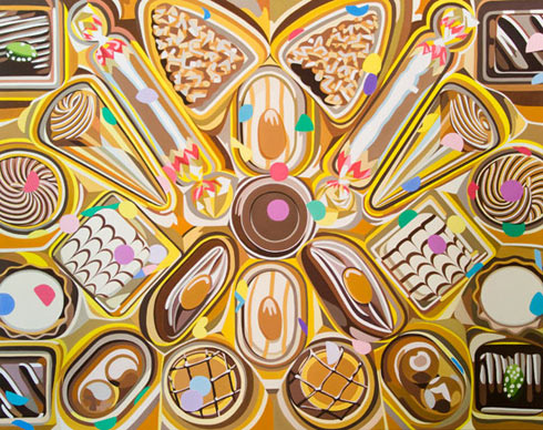
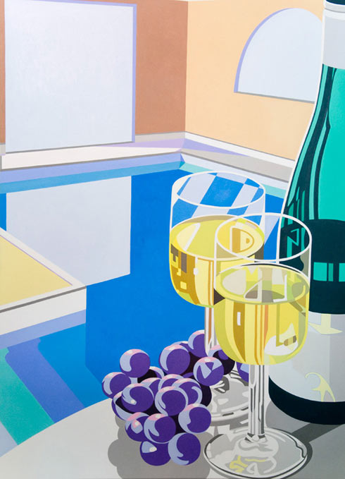
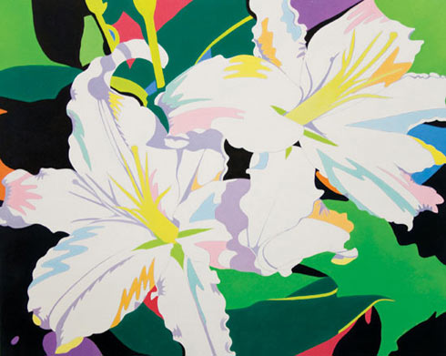
That said, The Narrows is treading the line between art and design, perhaps moving towards art with design aesthetic. “There is more confidence in the visual art world… probably because designers’ creativity is beaten with a club by clients in a commercial world, they are forever being told to ‘make it bigger/make it longer/move this over there…’,” Taylor comments. The next show opening in March is by Australian painter Madeline Kidd titled Cruise Collection referencing “the sensory things that make life more beautiful,” colour, luxury, beauty and indulgence.
Earlier in March (the 11th) the gallery is holding an annual fundraiser where 12 visual artists submit a work to be printed on an A3 poster using on an offset printer in one colour. The resulting monochromatic artwork, which will be sold on the night, will include 50 prints “reproduced in a way where the artists have no say how they will look in the end.” It’s sort of a collaboration between artist and gallery in a way, using art and overlaying it with a design feature.
While The Narrows has a diverse range of projects integrating Australian art and design disciplines in a contemporary context, Taylor is happy to justify a heavy international contingent. “The international shows are simply more popular across the board,” he says, “and I think local designers in particular are already displaying their work really well in their own forums, sometimes the gallery isn’t right for that.” The first international exhibition they exhibited was by Experimental Jetset (the guys who made t-shirts with the Beatles’ names on them). Then they had the Swiss poster show, where the gallery exhibited the posters designed for the promotion of exhibitions at the Museum of Design in Zurich. Another of their early shows was the research material for a PhD thesis on a jazz producer from the ’50s, and more recently they showed work by Brazilian graphic designer Rogerio Duarte. So there has been quite an impressive history since opening the gallery in 2006. Nonetheless, Taylor says he is often asked why he doesn’t support more young local designers, but in a round about way, that is exactly what he is doing. Without a gallery like this, how would a 19-year-old designer ever get to see the best work from Brazil for example? What The Narrows is providing for Melbourne’s art community is a certain aesthetic to a certain audience, that isn’t confined to just design-savvy.
The Narrows
Next story: Big Fish – Pond